The best way to show how Pandas can read html data from the internet is through a brief example and a demonstration of why it may be useful. Admittedly, Pandas may not be the best tool for this type of task in comparison with other packages such as BeautifulSoup. However, this article will show how to download tabular data from the internet and show it in a nice plot.
To fully following along with this article you should install ploty by typing the following command:
pip install plotly_express==0.4.0
Ok, now on to downloading the first dataset. We will use statistics from Wikipedia found here. This can take a bit of trial and error using Pandas read_html method depending on the url. Import Pandas and type the following into your script.
import pandas as pd

url = 'https://en.wikipedia.org/wiki/List_of_countries_by_traffic-related_death_rate'
df = pd.read_html(url)[1]

df.head()
That looks like a bit of a mess right? Let's clean it up a bit.
#delete columns occuring after deaths per capita
df = df.iloc[:,0:3]

#rename the deaths per capita to something easier to work with
df.columns = ['Country','Continent','deaths_per_capita']

# remove rows that aren't countries
df = df[pd.notna(df.Continent)]

##change the deaths column to numeric
df['deaths_per_capita'] = pd.to_numeric(df.deaths_per_capita,
                                              errors='coerce')

#inspect first 5 rows of data
df.head()
Executing the script above should return
        Country Continent deaths_per_capita
7   Afghanistan      Asia              15.5
8       Albania    Europe              13.6
9       Algeria    Africa              23.8
10      Andorra    Europe               7.6
11       Angola    Africa              26.9
Ok that looks much better!
Since we want to make a nice plot with the data, something similar to what the Ploty docs show in their examples, we will download the country codes from worldatlas.com as this seems to be the way Ploty identifies countries on their choropleth maps.
The code is as follows:
url2 = 'https://www.worldatlas.com/aatlas/ctycodes.htm'

##notice this is [0] as opposed to [1] in previous example
df2 = pd.read_html(url2)[0]

df2.columns = ['Country', 'A2', 'A3', 'Num', 'Dialing_code']

df2.head()
The reason we use [0] here instead of [1] is due to the fact that there are often multiple tables on any given url and it takes some trial and error to get the desired data in Python.
The column of interest here is 'A3' so we are going to merge the datasets together on the 'Country' column. The reason that Russia had to be manually set is due to worldatlas.com listing Russia as Russia Federation.
df2.Country[181] = 'Russia'

###inner just takes the values present in both dfs
df3 = pd.merge(df,df2,how='inner',on='Country')

df3.head()
So let's get to the best part!
from plotly.offline import plot
import plotly.graph_objs as go


fig = go.Figure(data=go.Choropleth(
    locations = df3['A3'],
    z = df3['deaths_per_capita'],
    text = df3['Country'],
    colorscale = 'hot',
    autocolorscale=False,
    reversescale=True,
    marker_line_color='darkgray',
    marker_line_width=0.5,
    colorbar_title = 'Deaths<br>Per 100,000',
))

fig.update_layout(
        title_text='Road Deaths Per Capita',
        title_x=0.50)


plot(fig)
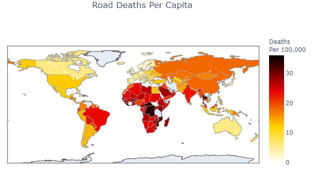
If all goes as planned after executing the script above, your browser should automatically open a window with an interactive graph that looks like this:
The full code for this article is as follows:
import pandas as pd

url = 'https://en.wikipedia.org/wiki/List_of_countries_by_traffic-related_death_rate'
df = pd.read_html(url)[1]

###delete columns occuring after deaths per capita
df = df.iloc[:,0:3]

#rename the deaths per capita to something easier to work with
df.columns = ['Country','Continent','deaths_per_capita']

df = df[pd.notna(df.Continent)]

df['deaths_per_capita'] = pd.to_numeric(df.deaths_per_capita,
                                              errors='coerce')


url2 = 'https://www.worldatlas.com/aatlas/ctycodes.htm'

df2 = pd.read_html(url2)[0]

df2.columns = ['Country', 'A2', 'A3', 'Num','Dialing_code']

df2.Country[181] = 'Russia'

df3 = pd.merge(df,df2,how='inner',on='Country')


from plotly.offline import plot
import plotly.graph_objs as go


fig = go.Figure(data=go.Choropleth(
    locations = df3['A3'],
    z = df3['deaths_per_capita'],
    text = df3['Country'],
    colorscale = 'hot',
    autocolorscale=False,
    reversescale=True,
    marker_line_color='darkgray',
    marker_line_width=0.5,
    colorbar_title = 'Deaths<br>Per 100,000',
))

fig.update_layout(
        title_text='Road Deaths Per Capita',
        title_x=0.50)


plot(fig)