It often useful to create rolling versions of the statistics discussed in part 1 and part 2.
For this article we will use S&P500 and Crude Oil Futures from Yahoo Finance to demonstrate using the rolling functionality in Pandas. Run the code snippet below to import necessary packages and download the data using Pandas:
import pandas as pd
import pandas_datareader.data as web
import numpy as np
import matplotlib.pyplot as plt
import datetime as dt
plt.style.use('ggplot')

start = dt.datetime(2015,1,1)
end = dt.datetime(2020, 1,1)

symbols = ['CL=F','^GSPC']

source = 'yahoo'

df = web.DataReader(symbols, source, start, end)['Adj Close']
df.columns = ['Oil', 'SP500']

df.head()
Out[1]:
                  Oil        SP500
Date
2015-01-02  52.689999  2058.199951
2015-01-05  50.040001  2020.579956
2015-01-06  47.930000  2002.609985
2015-01-07  48.650002  2025.900024
2015-01-08  48.790001  2062.139893
Add columns for percentage change for each of the columns:
df['SP500_R'] = df.SP500.pct_change()
df['Oil_R'] = df.Oil.pct_change()
df.dropna(inplace=True)
df.head()
                  Oil        SP500   SP500_R     Oil_R
Date
2015-01-05  50.040001  2020.579956 -0.018278 -0.050294
2015-01-06  47.930000  2002.609985 -0.008893 -0.042166
2015-01-07  48.650002  2025.900024  0.011630  0.015022
2015-01-08  48.790001  2062.139893  0.017888  0.002878
2015-01-09  48.360001  2044.810059 -0.008404 -0.008813
Moving Average
The syntax for calculating moving average in Pandas is as follows:
df['Column_name'].rolling(periods).mean()
Let's calculate the rolling average price for S&P500 and crude oil using a 50 day moving average and a 100 day moving average. Notice here that you can also use the df.columnane as opposed to putting the column name in brackets.
###moving averages S&P500
df['SPmoving_avg_50'] = df['SP500'].rolling(50).mean()
df['SPmoving_avg_100'] = df.SP500.rolling(100).mean()

## moving averages Oil
df['Oil_moving_avg_50'] = df.Oil.rolling(50).mean()
df['Oil_moving_avg_100'] = df['Oil'].rolling(100).mean()

print(df)
                  Oil        SP500  ...  Oil_moving_avg_50  Oil_moving_avg_100
Date                                ...
2015-01-05  50.040001  2020.579956  ...                NaN                 NaN
2015-01-06  47.930000  2002.609985  ...                NaN                 NaN
2015-01-07  48.650002  2025.900024  ...                NaN                 NaN
2015-01-08  48.790001  2062.139893  ...                NaN                 NaN
2015-01-09  48.360001  2044.810059  ...                NaN                 NaN
              ...          ...  ...                ...                 ...
2019-12-23  60.520000  3224.010010  ...            57.0794             56.2292
2019-12-26  61.680000  3239.909912  ...            57.2190             56.3065
2019-12-27  61.720001  3240.020020  ...            57.3816             56.3671
2019-12-30  61.680000  3221.290039  ...            57.5590             56.4370
2019-12-31  61.060001  3230.780029  ...            57.7130             56.5113

[1247 rows x 8 columns]
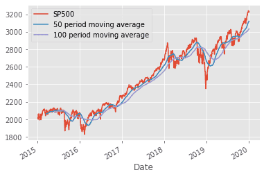
When using Panda's rolling function there will always be NaN values equal to the rolling period used for obvious reasons, we can drop the NaN values using the dropna() command, however we will leave them for this article. Let's plot the moving averages along with the S&P to visualize the data.
df.SP500.plot()
df.SPmoving_avg_50.plot(label='50 period moving average')
df.SPmoving_avg_100.plot(label='100 period moving average')
plt.legend()
Rolling Standard Deviation
Implementing a rolling version of the standard deviation as explained here is very simple, we will use a 100 period rolling standard deviation for this example:
## Rolling standard deviation S&P500
df['SP_rolling_std'] = df.SP500_R.rolling(100).std()

# rolling standard deviation Oil
df['Oil_rolling_std'] = df.Oil_R.rolling(100).std()
This is exactly the same syntax as the rolling average, we just use .std() as opposed to .mean()
Rolling Correlation
To implement a rolling version of the correlation statistic described here the syntax is as follows:
df['Column_one'].rolling(periods).corr(df['Column_2'])
We will use a 100 period rolling correlation between the S&P500 and Crude oil to demonstate this:
## rolling correlation between S&P and Oil
df['rolling_100_correlation'] = df.SP500_R.rolling(100).corr(df.Oil_R)
Visualizing Rolling Statistics
In order to show how the correlation and standard deviation can evolve over time, let's plot them over the sample period to see how they change as a function of time.
from matplotlib.gridspec import GridSpec

fig=plt.figure(figsize=(10,8))

Grid=GridSpec(3,2)

ax1=fig.add_subplot(Grid[0,0])
ax1.plot(df.SP500,color='black',linewidth=1,
         label='SP500')
ax1.plot(df.SPmoving_avg_50, linestyle='-.',
         label='50 moving avg')
ax1.plot(df.SPmoving_avg_100, linestyle='-.',
         label='100 moving avg')
plt.legend()

ax2=fig.add_subplot(Grid[0,1])
ax2.plot(df.Oil,color='black', linewidth=1,
         label='Oil')
ax2.plot(df.Oil_moving_avg_50,linestyle='-.',
         label='50 moving avg')
ax2.plot(df.Oil_moving_avg_100, linestyle='-.',
         label='100 moving avg')
plt.legend()

ax3 = fig.add_subplot(Grid[1,0])
ax3.plot(df.SP_rolling_std,color='red',
         label='rolling')
plt.axhline(y=df.SP500_R.std(), color='black',
            linestyle=':',label='constant')
ax3.set_title('S&P Standard Deviation')
plt.legend()

ax4 = fig.add_subplot(Grid[1,1])
ax4.plot(df.Oil_rolling_std,color='red',
         label='rolling')
plt.axhline(y=df.Oil_R.std(), color='black',
            linestyle=':',label='constant')
ax4.set_title('Oil Standard Deviation')
plt.legend()

ax5=fig.add_subplot(Grid[2,:])
ax5.plot(df.rolling_100_correlation,color='blue',
         label='rolling')
plt.axhline(y=df.SP500_R.corr(df.Oil_R),
            color='black',linestyle=':',
            label='constant')
ax5.set_title('Rolling correlation')
plt.legend()

plt.tight_layout()
plt.show()
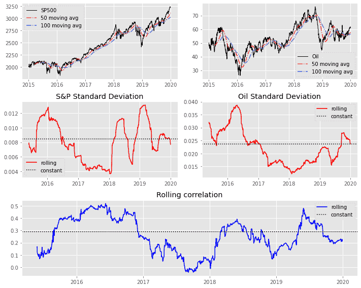
It is clear from the charts above, that the statistics can vary significantly over the sample period. Notice the dashed black lines on the charts above, which corresponds to the statistic calculated as a constant using the data for the entire sample, we can clearly see the rolling version is significantly different at many points throughout the five year period. This should give you an idea of why it can be useful to use more recent data to calculate statistics.