In this article we will discuss the groupby method in Pandas. The best way to understand this is by using examples, therefore this article will give a number of real-life examples for which this method can be useful. The examples used:
- World Airports Data
- Temperature Data
- Premier League Football Data
Example 1: Global Airports
The website openflights.org kindly provides a number of open source datasets related to global air travel. A short description of the dataset taken from their website:
"As of January 2017, the OpenFlights Airports Database contains over 10,000 airports, train stations and ferry terminals spanning the globe"

Each of the red dots above corresponds to an transport terminal, for the purposes of this article we will only be using airports.
We can download the dataset directly into Python from github.
import pandas as pd
import matplotlib.pyplot as plt
%matplotlib inline

url = 'https://raw.githubusercontent.com/jpatokal/openflights/master/data/airports.dat'
df = pd.read_csv(url)
df.columns = ['Airport_ID', 'name', 'city', 'country', 'IATA',
                                 'ICAO', 'lat', 'long',
                                 'alt', 'timezone','DST', 'db_time',
                                 'type','source']
Let's take a look at some of the columns of interest
df[['country','city', 'name']].head()
            country          city                                         name
0  Papua New Guinea        Madang                               Madang Airport
1  Papua New Guinea   Mount Hagen                 Mount Hagen Kagamuga Airport
2  Papua New Guinea        Nadzab                               Nadzab Airport
3  Papua New Guinea  Port Moresby  Port Moresby Jacksons International Airport
4  Papua New Guinea         Wewak                  Wewak International Airport
Say we want to answer two questions:
1) Which country has the most airports?
2) Which city has the most airports?
Question 1
We will determine the answer to these questions using pandas groupby. Essentially we want to count the number of airports in each country and select the top 10, plot their values and inspect the numbers.
Here we groupby the country column as it is our column of interest. The .size() method counts the number of occurences.
countries= df.groupby('country').size().sort_values(ascending=False)
#plot barchart
countries.head(10).plot.barh()
#print raw numbers
print(countries.head(10))
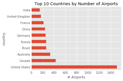
out:
country
United States     1512
Canada             430
Australia          334
Brazil             264
Russia             264
Germany            249
China              241
France             217
United Kingdom     167
India              148
dtype: int64
Question 2
This time we are interested in the number of airports per city. Therefore we should pass in 'city' to the groupby function as follows:
cities = df.groupby('city').size().sort_values(ascending=False)

cities.head(10).plot.barh()
plt.xlabel('# Airports')
plt.title('Top 10 Cities by Number of Airports')
plt.tight_layout()
print(cities.head(10))
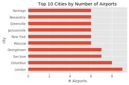
out:
city
London          9
Columbus        8
San Jose        7
Georgetown      7
Moscow          6
New York        6
Jacksonville    6
Greenville      6
Alexandria      6
Santiago        6
dtype: int64
So from the data it seems that the USA is the country with the most airports, and London is the city with the most airports.
Example 2: Weather Data
In the next example we will consider weather data from fivethirtyeight thankfully we can also download this directly into Python from github. Download the dataset by executing the following commands.
df = pd.read_csv('https://raw.githubusercontent.com/fivethirtyeight/data/master/us-weather-history/KCLT.csv')

print(df.head(5))
print(df.columns)
out:
       date  actual_mean_temp  ...  average_precipitation  record_precipitation
0  2014-7-1                81  ...                   0.10                  5.91
1  2014-7-2                85  ...                   0.10                  1.53
2  2014-7-3                82  ...                   0.11                  2.50
3  2014-7-4                75  ...                   0.10                  2.63
4  2014-7-5                72  ...                   0.10                  1.65
out:
Index(['date', 'actual_mean_temp', 'actual_min_temp', 'actual_max_temp',
       'average_min_temp', 'average_max_temp', 'record_min_temp',
       'record_max_temp', 'record_min_temp_year', 'record_max_temp_year',
       'actual_precipitation', 'average_precipitation',
       'record_precipitation'],
      dtype='object')
The data appears to be in daily increments for slightly over a year between 2014 - 2015. Let's answer two relatively simple questions using the data.
1) What was the hottest month of the year?
2) Which months had the most rain?
Question 1
In order to answer question 1 there are a number of steps we must take first to get the data in the correct format for further analysis. First convert the date column into a pandas datetime. Then create a month column: Jan =1 , Feb =2 , .... , Dec=12.
df['date'] = pd.to_datetime(df.date) #convert to pd.datetime
df['month'] = df.date.dt.month # create month column
Then group the data by the month column we just created and print the mean temperature per month.
month = df.groupby('month')
print(month['actual_mean_temp'].mean())
out:
month
1     40.516129
2     37.714286
3     54.387097
4     62.466667
5     71.935484
6     80.333333
7     77.741935
8     76.580645
9     72.533333
10    63.225806
11    47.533333
12    45.967742
Name: actual_mean_temp, dtype: float64
#plotting the results above
df.groupby('month')['actual_mean_temp'].mean().plot.bar()
plt.ylabel('Temperature')
plt.title('Average Temperature by Month')
plt.tight_layout()
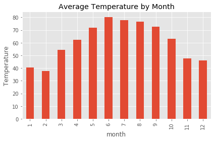
It looks like June had the higher average temperatures for the period of our analysis.
Question 2
Since we already have our grouped dataframe we can just change the column we are interested in. Notice that we can reference columns of our grouped dataframe by grouped['column of interest'] which can be very useful.
#printing average rainfall by month
print(month['average_precipitation'].mean())
out:
month
1     0.110000
2     0.118571
3     0.129355
4     0.101333
5     0.102581
6     0.124667
7     0.118710
8     0.136129
9     0.108333
10    0.109677
11    0.104667
12    0.104839
Plot the results:
month['average_precipitation'].mean().plot.bar()
plt.ylabel('Rainfall')
plt.title('Average Rainfall by Month')
plt.tight_layout()
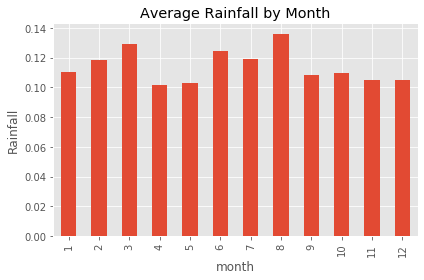
It looks like August had the highest amount of rainfall during the period of analysis
Example 3: Premier League Football
In the third and final example we will use a dataset from footall-data.co.uk who kindly aggregate a number of football datasets from various leagues. We will use the Premier League results from 2019/2020 season. We can download the dataset directly from their website using Pandas as follows:
df = pd.read_csv('http://www.football-data.co.uk/mmz4281/1920/E0.csv')
print(df)
    Div        Date   Time        HomeTeam  ... MaxCAHH  MaxCAHA  AvgCAHH AvgCAHA
0    E0  09/08/2019  20:00       Liverpool  ...    1.99     2.07     1.90    1.99
1    E0  10/08/2019  12:30        West Ham  ...    2.07     1.98     1.97    1.92
2    E0  10/08/2019  15:00     Bournemouth  ...    2.00     1.96     1.96    1.92
3    E0  10/08/2019  15:00         Burnley  ...    1.90     2.07     1.86    2.02
4    E0  10/08/2019  15:00  Crystal Palace  ...    2.03     2.08     1.96    1.93
..   ..         ...    ...             ...  ...     ...      ...      ...     ...
375  E0  26/07/2020  16:00       Leicester  ...    1.94     2.05     1.86    2.02
376  E0  26/07/2020  16:00        Man City  ...    2.06     1.88     2.02    1.84
377  E0  26/07/2020  16:00       Newcastle  ...    2.03     2.00     1.95    1.92
378  E0  26/07/2020  16:00     Southampton  ...    2.03     1.96     1.98    1.89
379  E0  26/07/2020  16:00        West Ham  ...    1.99     2.00     1.93    1.95

[380 rows x 106 columns]
As you can see the dataset has a lot of columns. We are going to use this data to answer two questions:
1) Which team scored the most average goals whilst playing at home.
2) Which team scored the most average goals whilst playing away.
Question 1
To answer this question we first need to decide on which columns are relevant to our problem. Obviously the 'HomeTeam' column is important as it is what we are trying to analyze. There are two more important columns we will need for this analysis:
FTHG: This column represents Full Time Home Goals
FTAG: This column represents Full Time Away Goals
So we need to groupby 'HomeTeam' and then extract the FTAG column described above.
hometeams = df.groupby('HomeTeam')

#extract the average full time home goals from grouped df

hometeams['FTHG'].mean()
Out:
HomeTeam
Arsenal             1.894737
Aston Villa         1.157895
Bournemouth         1.157895
Brighton            1.052632
Burnley             1.263158
Chelsea             1.578947
Crystal Palace      0.789474
Everton             1.263158
Leicester           1.842105
Liverpool           2.736842
Man City            3.000000
Man United          2.105263
Newcastle           1.052632
Norwich             1.000000
Sheffield United    1.263158
Southampton         1.105263
Tottenham           1.894737
Watford             1.157895
West Ham            1.578947
Wolves              1.421053
Name: FTHG, dtype: float64
The interpretation of the output above is the average number of goals scored per team whilst playing at home. Another interesting fact we can extract from this grouped dataframe is the average number of goals each of the teams conceeded whilst playing at home.
hometeams['FTAG'].mean()
HomeTeam
Arsenal             1.263158
Aston Villa         1.578947
Bournemouth         1.578947
Brighton            1.421053
Burnley             1.210526
Chelsea             0.842105
Crystal Palace      1.052632
Everton             1.105263
Leicester           0.894737
Liverpool           0.842105
Man City            0.684211
Man United          0.894737
Newcastle           1.105263
Norwich             1.947368
Sheffield United    0.789474
Southampton         1.842105
Tottenham           0.894737
Watford             1.421053
West Ham            1.736842
Wolves              1.000000
Name: FTAG, dtype: float64
Obviously the smaller the number here the better. However, it may not be obvious exactly what is going on here. Since we are grouping by hometeam, when we get the average number of away goals, this means the number of goals the oppositions team scored whilst the hometeam was playing on their homegrounds.
Let's visualize the results obtained above.
df.groupby('HomeTeam')[['FTHG','FTAG']].mean().plot.barh(figsize=(6,6))
plt.xlabel('Average Goals')
plt.title('Premier League 2019/2020')
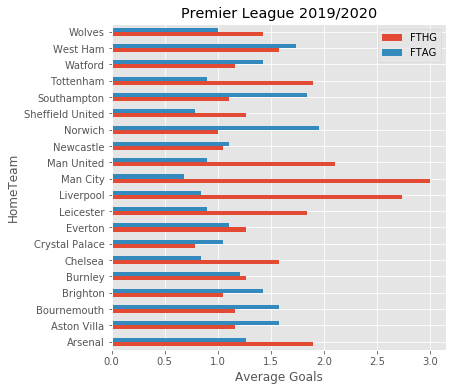
As you would expect, the usual suspects are doing the best in the plot above. It looks like Man City has the best record. Although, obviously this doesn't necessarily translate into winning games, or the league for that matter, as in fact Liverpool won last season.
Question 2
To answer this question we simply need to change the column we are grouping by as follows:
df.groupby('AwayTeam')[['FTHG','FTAG']].mean().plot.barh(figsize=(6,6))
plt.xlabel('Average Goals')
plt.title('Premier League 2019/2020')
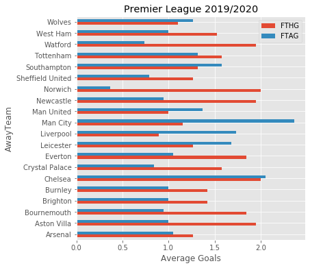
So since the blue bars above represent goals scored whilst playing away, the higher numbers are better. Again it looks like Man City are doing the best in this regard as well. Norwich seem to be doing the worst. As an exercise you could convert these numbers into ratios and plot them again.
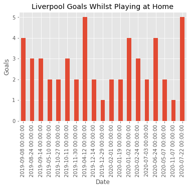
Bonus Question
In this question will we make use of pandas groupby.get_group( ) method, which can often come in handy. Let's say for example we want to extract the number of goals Liverpool scored per game whilst playing at home. First let's set the index to be a pandas datetime so its more interpretable. Then extract the number of goals Liverpool scored whilst playing at home.
df['Date'] = pd.to_datetime(df.Date)
df.set_index('Date',inplace=True)

liverpool_HG = df.groupby('HomeTeam')['FTHG'].get_group('Liverpool')
print(liverpool_HG)
Out:
Date
2019-09-08    4
2019-08-24    3
2019-09-14    3
2019-05-10    2
2019-10-27    2
2019-10-11    3
2019-11-30    2
2019-04-12    5
2019-12-14    2
2019-12-29    1
2020-02-01    2
2020-01-19    2
2020-01-02    4
2020-02-24    3
2020-07-03    2
2020-06-24    4
2020-05-07    2
2020-11-07    1
2020-07-22    5
Name: FTHG, dtype: int64
Visualizing the results
liverpool_HG.plot.bar()
plt.title('Liverpool Goals Whilst Playing at Home')
plt.ylabel('Goals')