In this article we will calculate the a number of well know statistics related to risk and reward in equities. In order to provide examples on real data we will use the following stocks to illustrate the concepts shown. Since the statistics in question are usually calculated on a portfolio, we will add an equal weighted portfolio to the analysis also.
- Apple: Stock ticker = AAPL
- Amazon: Stock ticker = AMZN
- Facebook: Stock ticker = FB
- Google: Stock ticker = GOOGL
- Microsoft: Stock ticker = MSFT
- Port: Equally weighted portfolio of the securities above.
Statistics to be calculated
- Sharpe ratio
- Sortino Ratio
- Max Drawdown
- Calmar Ratio
Getting the Data
In order to get the data necessary to complete this analysis we will make use of Pandas Datareader, which allows us to directly download stock data into Python. Execute the following code block in your editor:
import pandas_datareader.data as web
import datetime as dt
import numpy as np
import pandas as pd
import matplotlib.pyplot as plt
plt.style.use('ggplot')


start = dt.datetime(2013, 1, 1)
end = dt.datetime(2020, 10, 1)

tickers = ['AAPL', 'AMZN', 'MSFT', 'GOOGL','FB']

stocks = web.DataReader(tickers,
                        'yahoo', start, end)['Adj Close']

stocks.head()
Out:
Symbols          AAPL        AMZN       MSFT       GOOGL         FB
Date
2013-01-02  17.094694  257.309998  23.241472  361.987000  28.000000
2013-01-03  16.878920  258.480011  22.930120  362.197205  27.770000
2013-01-04  16.408764  259.149994  22.500971  369.354340  28.760000
2013-01-07  16.312239  268.459991  22.458902  367.742737  29.420000
2013-01-08  16.356150  266.380005  22.341091  367.017029  29.059999
Change the dataframe to percentage change and create a column for the equally weighted portfolio. Plot the normalized stock prices for comparison.
df = stocks.pct_change().dropna()
df['Port'] = df.mean(axis=1) # 20% apple, ... , 20% facebook
(df+1).cumprod().plot()

(df+1).cumprod()[-1:]
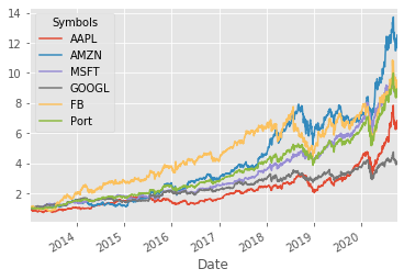
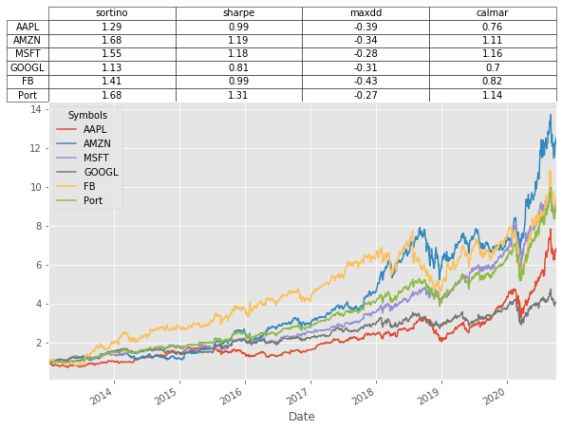
The plot shows the growth of $1 invested on 1st Jan 2013 until 10th Oct 2020. For every $1 you invested in Apple in 2013 you would now have approximately $7 and so-forth.
Symbols         AAPL       AMZN      MSFT     GOOGL      FB      Port
Date
2020-10-01  6.831944  12.518985  9.141418  4.110369  9.5225  8.936468
Sharpe Ratio
The Sharpe ratio is the most common ratio for comparing reward (return on investment) to risk (standard deviation). This allows us to adjust the returns on an investment by the amount of risk that was taken in order to achieve it. The Sharpe ratio also provides a useful metric to compare investments. The calculations are as follows:
\(\text{Sharpe ratio} = \frac{\bar{R}-R_f}{\sigma}\)
\(\bar{R} \): annual expected return of the asset in question.
\(R_f\) : annual risk-free rate. Think of this like a deposit in the bank earning x% per annum.
\(\sigma\) : annualized standard deviation of returns
Since our data frequency is daily we need to annualize the expected return and standard deviation. This can be achieved by multiplying the daily average return by 255. And multiplying the daily standard deviation by \(\sqrt 255\). For simplicity we will assume that the risk-free rate \(R_f\) = 1% throughout the 7 year period.
Python code to calculate Sharpe ratio:
def sharpe_ratio(return_series, N, rf):
    mean = return_series.mean() * N -rf
    sigma = return_series.std() * np.sqrt(N)
    return mean / sigma

N = 255 #255 trading days in a year
rf =0.01 #1% risk free rate
sharpes = df.apply(sharpe_ratio, args=(N,rf,),axis=0)

sharpes.plot.bar()
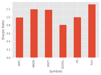
The interpretation of the Sharpe ratio is that higher numbers relate to better risk-adjusted investments. Recall the total return numbers we calculated previously, and notice that even though the majority of the individual stocks had a higher return, they also had a higher standard deviation.
Sortino Ratio
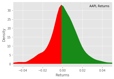
The Sortino ratio is very similar to the Sharpe ratio, the only difference being that where the Sharpe ratio uses all the observations for calculating the standard deviation the Sortino ratio only considers the harmful variance. So in the plot below, we are only considering the deviations colored red. The rationale for this is that we aren't too worried about positive deviations, however, the negative deviations are of great concern, since they represent loss of our money.
\(\text{Sortino ratio} = \frac{\bar{R}-R_f}{\sigma^-}\)
Everything in the ratio above is the same as the Sharpe ratio except \(\sigma^-\) represents the annualized down-side standard deviation.
Python code to calculate and plot the results.
def sortino_ratio(series, N,rf):
    mean = series.mean() * N -rf
    std_neg = series[series<0].std()*np.sqrt(N)
    return mean/std_neg


sortinos = df.apply(sortino_ratio, args=(N,rf,), axis=0 )
sortinos.plot.bar()
plt.ylabel('Sortino Ratio')
It looks like Amazon and the portfolio are almost neck-and-neck in terms of performance for this ratio. As with the Sharpe ratio, higher values are preferable.
Max Drawdown
Max drawdown quantifies the steepest decline from peak to trough observed for an investment. This is useful for a number of reasons, mainly the fact that it doesn't rely on the underlying returns being normally distributed. It also gives us an indication of conditionality amongst the returns increments. Whereas in the previous ratios, we only considered the overall reward relative to risk, however, it may be that consecutive returns are not independent leading to unacceptably high losses of a given period of time.
To calculate max drawdown first we need to calculate a series of drawdowns as follows:
\(\text{drawdowns} = \frac{\text{peak-trough}}{\text{peak}}\)
We then take the minimum of this value throughout the period of analysis.
Python code to calculate max drawdown for the stocks listed above.
def max_drawdown(return_series):
    comp_ret = (return_series+1).cumprod()
    peak = comp_ret.expanding(min_periods=1).max()
    dd = (comp_ret/peak)-1
    return dd.min()


max_drawdowns = df.apply(max_drawdown,axis=0)
max_drawdowns.plot.bar()
plt.yabel('Max Drawdown')
I believe max drawdown is usually presented as an absolute value, however, I will leave it the way it is for the time being. It looks like the portfolio performed the best according to max drawdown during the 7 year period we analyzed. The max drawdown should be interpreted as; numbers closer to zero are preferable.
Calmar Ratio
The final risk/reward ratio we will consider is the Calmar ratio. This is similar to the other ratios, with the key difference being that the Calmar ratio uses max drawdown in the denominator as opposed to standard deviation.
\(\text{Calmar ratio} = \frac{\bar{R}}{\text{max drawdown}}\)
calmars = df.mean()*255/abs(max_drawdowns)

calmars.plot.bar()
plt.ylabel('Calmar ratio')
It appears that Microsoft performs the best according to this ratio. As with the Sharpe and Sortino, higher values are preferable.
Wrapping up
If you would like to see these ratios applied to a more realistic backtest you can take a look at this crypto-algo trading example
Let's combine all the ratios we have calculated and put them in a pandas dataframe.
btstats = pd.DataFrame()
btstats['sortino'] = sortinos
btstats['sharpe'] = sharpes
btstats['maxdd'] = max_drawdowns
btstats['calmar'] = calmars

btstats
Out:
         sortino    sharpe     maxdd    calmar
Symbols
AAPL     1.286527  0.988260 -0.385159  0.758557
AMZN     1.678367  1.194467 -0.341038  1.107348
MSFT     1.549506  1.181460 -0.280393  1.158764
GOOGL    1.127802  0.808867 -0.308708  0.704477
FB       1.413423  0.994674 -0.429609  0.823078
Port     1.676891  1.311674 -0.274688  1.140057
Plotting dataframe as table
(df+1).cumprod().plot(figsize=(8,5))
plt.table(cellText=np.round(btstats.values,2), colLabels=btstats.columns,
          rowLabels=btstats.index,rowLoc='center',cellLoc='center',loc='top',
          colWidths=[0.25]*len(btstats.columns))
plt.tight_layout()